


After 50 seasons in the Cream City, the Milwaukee Brewers have unveiled an updated look as they enter the 2020 season.
The Logos
For the first time since 2000, the Brewers have made a major change in branding. The iconic “ball-in=glove” logo is back as their primary logo. But the logo isn’t exactly how you might remember it. The glove was streamlined and now has sharper lines and the “M” and “B” are now connected above the webbing of the glove. The ball in the glove was also updated with a new layout for the seams.
“We know there are going to be some people who wanted us to go back to the old ball-in-glove without any changes,” Brewers president of business operations Rick Schlesinger said. “Then there’s going to be some fans who say the current system was great. Maybe there’s even two of three people who say we should have gone back to the ‘94-‘00 version; I don’t know who those people are, but maybe there are some people.
“At the end of the day, I would sell this: We have elements from all of our historical brands and logos and uniforms. If you liked one particular system of our history, you’re going to find it somewhere.”
The “ball-in-glove” logo wasn’t the only logo brought back, the Brewers also refreshed the Barrelman logo. The classic Barrelman logo was cleaned up and updated with the new colors.
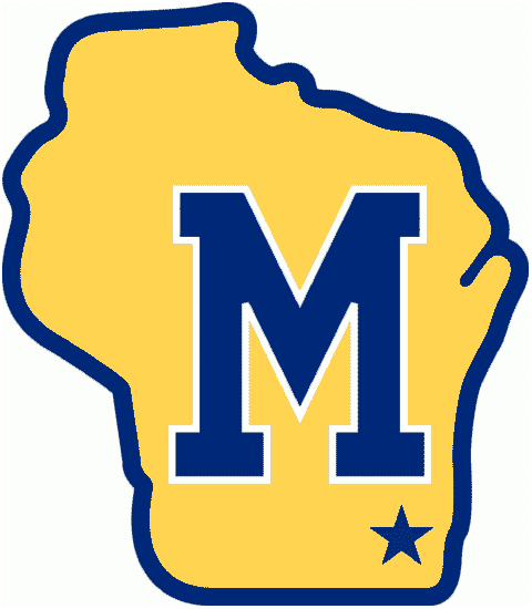
Other new logos include a wheat ball logo and a Wisconsin “M” logo. The wheat ball logo features wheat as the seams. The Wisconsin “M” logo is somewhat of a throwback to the 1970s secondary logo. The state logo features a block “M” like the old secondary logo, but this version has bricks behind the letter to pay homage to Milwaukee’s cream bricks. A baseball was placed in the location of Milwaukee.


The Uniforms
Starting with the primary home uniform, the new threads are now cream-colored, instead of the traditional white, in honor of Milwaukee’s nickname of the Cream City. The nickname comes after Milwaukee’s cream-colored bricks that make up many of the buildings and structures in the city. The sleeves of the jersey feature wide piping in honor of the Crew’s original uniform. The left sleeve has a wheat ball logo patch.
Their alternate home uniform is sticking with the white jersey with pinstripes, another nod to a past uniform. Like the primary home uniform, the left sleeve also has a wheat ball logo patch.
The primary gray road uniform features “Milwaukee” across the chest. The left sleeve patch honors the Brewers’ home state with the Wisconsin “M” logo.
The final uniform, a navy alternate road uniform features “Milwaukee” in a new script and yellow piping down the front. Like the gray jersey, this uniform also have the Wisconsin “M” logo on the left sleeve. To complete the look, this uniform will include a two-tone cap with yellow on the front.
All four jerseys with have a 50th anniversary patch on the right sleeve during the 2020 season.
This will be the Brewers and MLB’s first year under the new Nike contract.


The Design Proces
The process of creating a new look began about two and a half years ago.
“We started this in 2016 and it’s been a work in progress,” Brewers owner Mark Attanasio said. “Hopefully next year we have a championship team, a great new logo, and 50 years to celebrate.”
The Brewers hired Mississippi-based designer Rodney Richardson of RARE Design. Richardson had no ties to the team, the state or MLB. Richardson’s work included rebrands in the NBA, NFL, NASCAR and more. Brewers management liked that he had no connection. He had a fresh perspective on everything.
“Going into this process, the Brewers didn’t put any pressure on us to go one way or the other,” Richardson said. “They said, ‘We’re going to go through this process and discover the things we need to discover.’ The reality is that anyone who is any kind of sports fan whatsoever, you’re familiar with the ball-in-glove icon, how tremendous it is and how beloved it is.”
Everyone in the design process knew the “ball-in-glove” logo was going to be used, they just didn’t how or to what extent they could change it.
“We weren’t at all fearful to explore how far can we push it and still represent all the things that this identity still needs to represent,” Richardson said. “It got ‘out there.’ But I think intuitively we knew, and the organization knew, like, ‘That’s not it. That goes too far. We’ve got to respect the character of this mark.’
“But then, there are small updates to it that help the team tell stories that are near and dear to them. Like connecting the ‘M’ and the ‘B’ in the glove itself. That small thing from a design standpoint may not seem like that big of a deal, but what that tells from the team perspective is they see that bond between this city and this game.”
The Brewers hope to have every instance of the old logos removed from Miller Park or replace with the new logos by Opening Day. Everything from signage to carpeting and retail to business cards has to be updated.
“They have gone the entire four corners of this ballpark and also virtually, because … everything online has logos,” Schlesinger said. “For the last year and a half [we] have literally identified every place both in the virtual world and the real world, both in Miller Park and around Miller Park, that has the old logo.
“It’s a huge undertaking, and if we get 99.9 percent of it, that would be great. I’m sure there’s going to be a few things we miss. It might be a little game with our fans to find the old Brewers ball-in-glove.”
So if you’re at Miller Park during the 2020 season, let us know if you spot any of the old logos that they didn’t catch.