


On Tuesday morning, the Atlanta Hawks officially unveiled their new uniforms, colors and logos.
Taking inspiration from the team’s looks of the 1970s and 1980s, the Hawks brought back the red and yellow color scheme made famous during the Dominique Wilkins era.
- ‘Torch Red’, a color used by the team since their move to Atlanta in 1968, “symbolizes the heart of our unending quest for excellence, our red-hot spirit and fiery passion for the game.”
- ‘Legacy Yellow’, last used in 2007, is “A hue that shines brightly, reminding us of the of the shoulders we stand on.”
- ‘Infinity Black’, a color used in the 1990s and part of their 2015 brand redesign, “affirms the Atlanta Hawks’ bold and relentless pursuit of a championship, fueled by the support of our unwavering fans and the love for our city that will never die.”
- ‘Granite Gray’ signifies the team’s “firm foundation comprised of deep character, class, strength and integrity. Dedicated to supporting each other and our community.”
“Torch Red, Legacy Yellow and Infinity Black have been staples of the Hawks since arriving in Atlanta in 1968. With our new uniforms, we wanted to usher in a new golden era of Hawks Basketball while embracing the rich history and legacy of basketball in our great city,” said Atlanta Hawks & State Farm Arena CEO Steve Koonin.
‘Green Volt‘ has been removed from the team’s color scheme.

From the Atlanta Hawks:
As we enter the next era of Hawks basketball, we are returning to our roots. We are paying respect to our treasured past, with our sights focused on a bright future ahead. We are freshening our look while paying homage to the colors most synonymous with the Hawks organization. Taking the most beloved details of our past uniforms to create a look that blends past, present and future. Our new style is timeless and classic, reintroducing elements true Hawks fans have come to know and love as we enter a new golden era in pursuit of a championship.
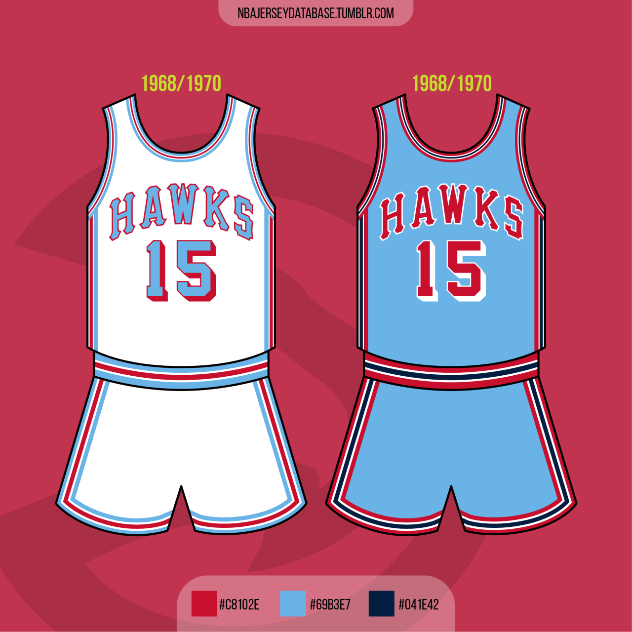
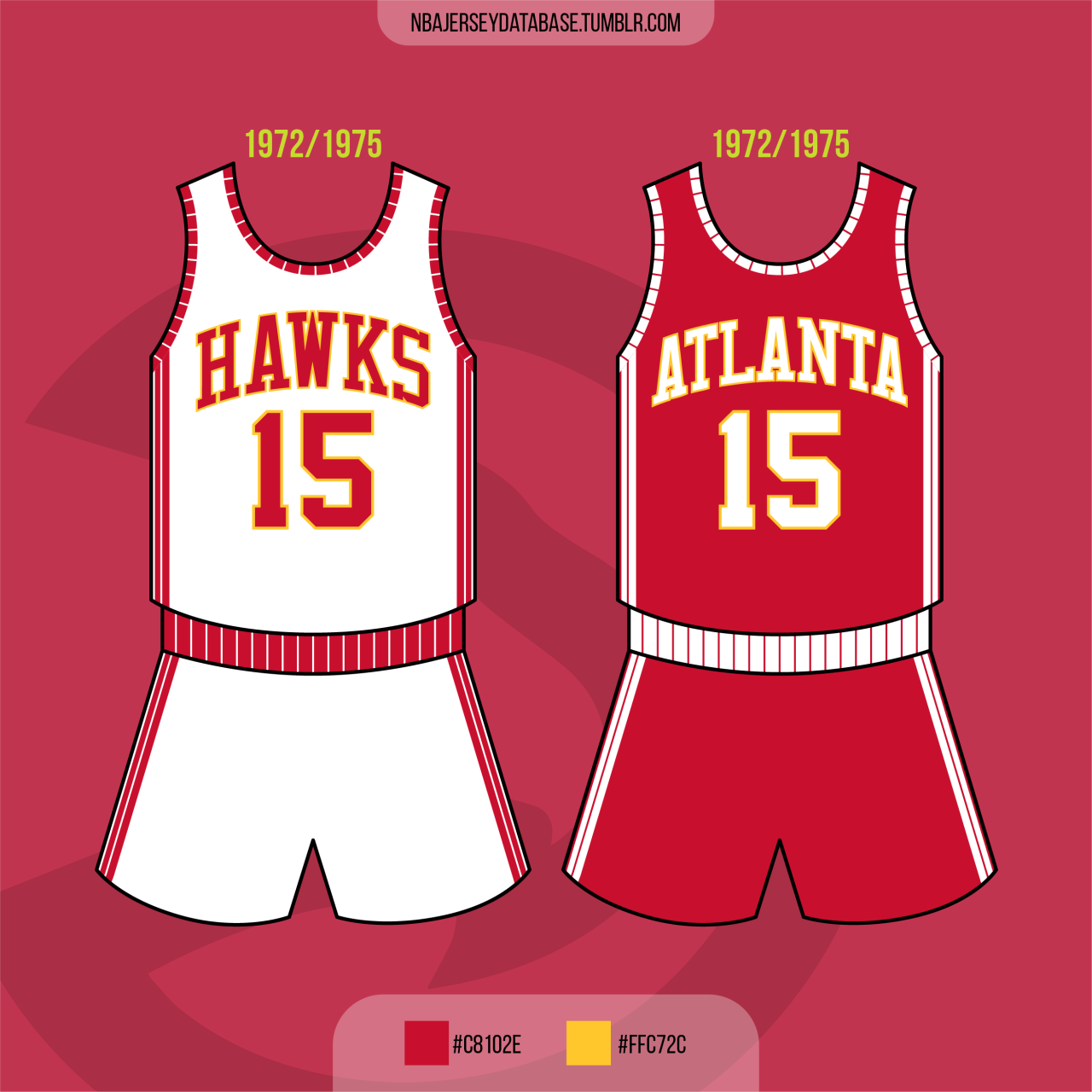
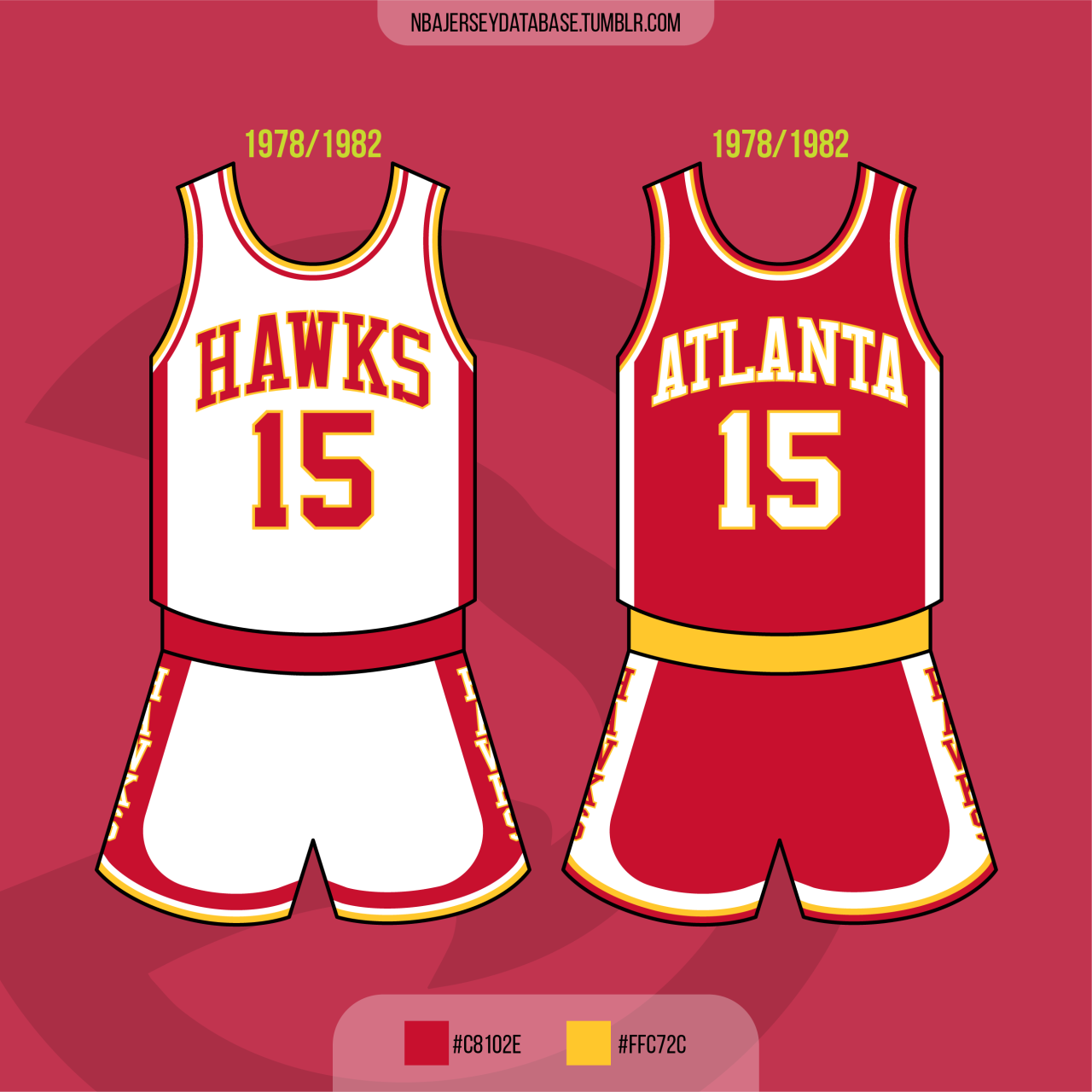
The three new uniforms take elements from Hawks’ uniforms of the 1960s through the 1980s. The numbers of the uniforms were inspired by their 1968-1970 uniform with the wordmarks coming from the 1972-1975 and 1978-1982 uniforms.
Starting with the ‘Association’ uniform, the white uniform features “Atlanta” across the chest with red filling the letters and numbers and drop shadowed with yellow. Red and yellow stripes alternate down the side of the uniform with the “Pac-Man” Hawks’ logo toward the bottom of the shorts. The collar and arm and leg trim also utilize red and yellow stripes. Atlanta’s new “Hawks” basketball wordmark appears on the front of the waistband.


Next, the red ‘Icon’ uniform also features Atlanta” across the chest with white filling the letters and numbers and drop shadowed with yellow. White and yellow stripes alternate down the side of the uniform with the “Pac-Man” Hawks’ logo toward the bottom of the shorts. The collar and arm and leg trim also utilize white and yellow stripes. Like the ‘Association’ uniform, the new “Hawks” basketball wordmark appears on the waistband.


Lastly, the black ‘Statement’ uniform features “Hawks” across the front with yellow filling the letters and numbers and drop shadowed with red. Red and black stripes alternate down the side of the uniform with a thick yellow stripe in the middle. The “Pac-Man” Hawks’ logo was recolored in yellow and black and appears toward the bottom of the shorts. The collar and arm and leg trim utilize red and black stripes. The new “ATL” basketball wordmark appears on the waistband.
Also announced today was that the Jordan Brand’s Jumpman logo will replace the Nike Swoosh logo on all 30 teams ‘Statement’ uniform.


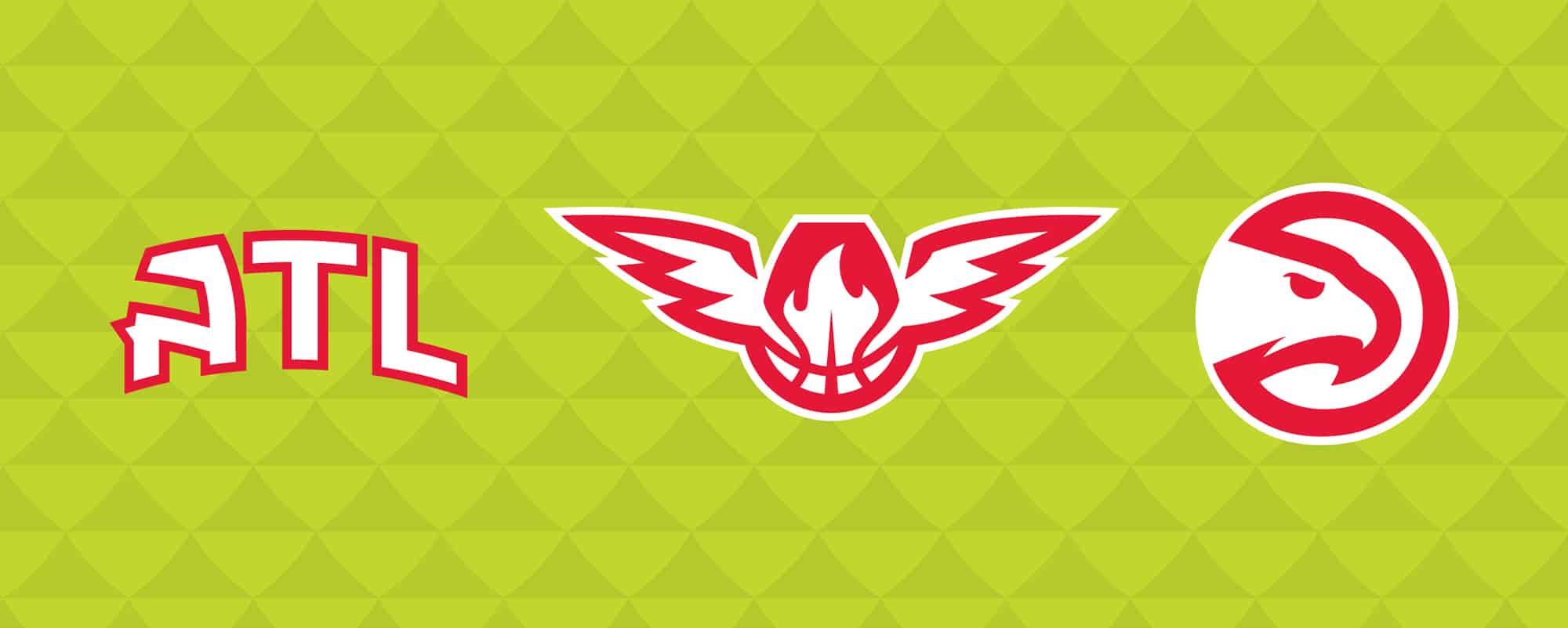
Atlanta also unveiled some new logos to complete the updated look. The ‘Primary Icon’ remains the same while the arched “ATL” wordmark and winged basketball logo have been replaced with new logos. The ‘Global Logo’ has been updated with the new font and the word “Club” has been removed. New wordmarks and secondary logos were created with the new font, which was inspired by the fonts used on the Hawks uniforms in the late 1960s to early 1980s. The Atlanta Hawks G-League affiliate, the College Park Skyhawks, has been using the font in their logo since they relocated from Erie, Pennsylvania in 2019.


